Website Advice for Magicians
I’m not a web designer. In fact, I’m almost completely useless when it comes to the technical side of building a website. This of course begs the question, “why am I writing this article?” Well, I’ve always admired good web design.
Most days of the week, I’ll chat on Skype with my good friend, Ade Gower of Monster Creations. Ade runs an incredibly successful Kent web design company that produces a lot of the fantastic packaging you see for magic tricks, along with tonnes of websites and print promo for magicians and entertainers. We often end up discussing the merits of different magician’s websites and there are a couple of things that always grate on us.
Ten years ago, if a magician said he had a website to a potential booker that was enough, they’d be genuinely impressed that you’d paid ten dollars for a domain name and threw up some pages on the net. Things have changed and particularly now magicians have upped their game and are constantly trying to improve their websites to make them look pretty and efficiently book gigs.
I am going to offer some tips that I think will improve your website, things that have come up in conversation with Ade. These will be of particular use to those looking to build a website, amateur magicians and semi pros although I do see these same issues on many professional magicians’ websites. It’s a mixture of common sense and the conjecture of a skilled designer. These are small things that you can do to make your site better in an hour or two.
You don’t have to understand how to build a website to make sense of these. As long as you know your Firefox from your firewall, you’ll be ok.
Using a Non Domain Email Address
Coming Soon Pages
Too Much Black
Splash Pages
A splash page is basically a pre-entry page before you enter the main site. Think of it like a gate before opening the front door of a house. The problem is that potential bookers haven’t got time to faff around, they are looking for info and then to action it, don’t slow them down! If you just have an image with a button saying ENTER, you have forced them to press the mouse one more time than they wanted to. You’ve managed to frustrate them and they haven’t even seen your site properly at this point.
Also, people tend to assume that visitors arrive via the homepage and proceed through the site looking at all the pretty pages before contact you but they don’t. They can arrive on any page depending on what they searched for, that means a massive chunk of people won’t even see your useless but pretty website gate.
Opening in New Browser Windows
If you're a kid - embrace it!
This isn’t a technical issue but it still bothers me. There are loads of talented young magicians in their teens and younger who build professional looking sites full of suspect quotes, clients and dodgy BS copy.
Many young magicians have got more skill with design and programming than magicians two or three times their age. They can build sites that portray them as experienced miracle workers but no potential booker will hire them given the option of an experienced older magician with all other factors being equal.
It looks weird seeing children trying to portray themselves as mini adults and trying to bill themselves on the same level. Wear more casual clothes, perform tricks that make sense for your age, don’t say dumb stuff like “I’m a great addition to a poker night” when you wouldn’t be allowed into a Snap competition.
Animated Gifs
Pop Ups
NO MORE POPUPS – they annoy everybody. The modern pop up blockers will stop most but you still see things like sliders, which come up from the bottom of the page and ask you to fill in contact details.
Music
Simple one – don’t have any music playing in the background on your website, none, zero. It may add to the ambience of the site to a few people but it will annoy the vast majority. Many people view websites at work or in private places and don’t want any attention on them. If music starts blearing out of the speakers, they have to dive to turn them down and you’ve lost a sale. If you are absolutely adamant you want music then make sure you clearly label a button “turn music off” in a clearly visible place.
No Photographs?
You can’t have a website without any pictures. Really, you need to have both action shots and good ”studio style” pictures of you. If you have the money, hire a pro to take pictures of you in a studio or in a location relevant to your style of performance e.g. street, stage etc.
I hear a lot of entertainers saying, “it’s hard to get pictures of live performance”. Well, if you do a few gigs there will very often be photographers at the event. If you see them taking pictures of you, ask for their card and immediately give them a “bribe” of £20 or so with a wink saying, “buy yourself a drink”. That way, they feel beholden to send you the pictures and you can always follow up and email them. If you just ask them nicely to send the pics, they will almost always forget. If you offer to buy them individually they may try and charge you £30 + an image.
If you are still struggling for pictures then bring a digital camera to a gig and give it to a kid and tell them to snap away, like it’s a game. Nobody will question a kid taking photos and then your only challenge is getting the camera back in one piece from the kid. Sure, most of the pictures will be terrible as they are just playing at being a photographer but you may well get one or two good shots from this. I certainly used this technique to get shots in the early days.
Write Your Own Copy
This is a massive one and a task that many magicians hate doing it but its ESSENTIAL. You want the words on your website to represent you as a performer. If you think you are a terrible writer you can get somebody else to do it for you. If you have the budget, you can pay a freelance copywriter from a site like Elance.
If you find it hard to generate the content, then try this. Write down ten questions in the 3rd person. Dream up the kind of questions you might be asked by an aggressive reporter, if they were doing a very in depth piece on you. Questions like, “why are you better than other magicians” and “how did you get started in magic”. Imagine you are being interviewed on a chat show about your magic. When you have done this, spend a few days slowly typing out your genuine answers. It’s a lot easier to answer these questions than to fill a blank page. You can then use this content to turn it into a unique page of text for your site. Show the questions to family and friends and see if they have any questions they’d like to know the answers to and add them to the list.
If you are totally bereft of ideas and broke, then beg somebody you know to write for you. Everybody knows somebody who is a decent writer but above all don’t copy and paste the words from another magician’s website.
The online world is a small place and you don’t want to get caught out plagiarising text. You might think it’s a small crime but you are stealing the intellectual property of another performer. It took them hours and days to compose the sales copy and you waltzed straight in and stole it. There are sites like Copyscape that many professional magicians use to check their text hasn’t been stolen. I make time every few months to run my site through Copyscape and I always find a few offenders who have stolen pages and text from me. It takes time and effort to email them asking them to remove it.
Dead Links
Check your site once every couple of months to make sure all links work. When it comes to coding, a tiny error will result in the page failing to load which will frustrate the visitor….the result – they leave.
Outdated Info
You see this all the time. Blogs and websites with headlines saying “New photos/videos/act/tricks coming summer 2010” and you click on the link and there is nothing. If you miss the deadline, remove the bit from your site plugging it. You can keep changing the date to 6 months in the future but a missed “event date” immediately dates your site. The visitor knows that the site isn’t cared for and what does that mean for potential bookings – maybe you won’t care about their event?!
Magic For All Occasions
What the hell does magic for all occasions mean? Would it a good idea for a funeral? Don’t say you are the man for every occasion, instead be a specialist. There are loads of places where booking a magician will not aid the event and they are far better with another type of entertainer or no entertainment at all.
Kids and Adults
If you perform for children and adults you cannot have one website that has information about both services. Bookers don’t want to see the potential entertainer for their corporate party wearing clown shoes and a funny hat. You really have to have two separate sites for both services, they are completely different and don’t complement each other at all.
The usual compromise is an opening entry page that has a choice of which part of the site you wish to visit – kids or adults, but then you are back to the argument of not having a splash page. You’ve got to keep both parts of the business separate and promote them separately.
Award Winning?
So many magicians say they are award winning that it becomes meaningless. If everybody has won something then it stops being the difference between you and the competition. I’m sure every magician reading this has at some point placed in some type of competition, even if it’s just the local magic club competition featuring fewer entrants than prizes available.
If you have placed in a major national or international competition then by all means brag about it, shout it from the rooftops. Don’t just list your competition achievements but explain their importance, tell the potential booker how much more impressive it is to win this than a pocket trick drive in Nowheresville.
Gallery is Vanity
If you have great promo shots then use them! Sprinkle them liberally around your site to break up chunks of text. No potential booker visits a magician’s website and thinks “Gee, I must look at this guy’s collection of random performance pictures”. Some magicians have convinced themselves that the booker is sat with a cup of tea; slowly leafing their way through the gallery like they are looking at a prized wedding album.
Don't Write in the First Person
All promotional material should be written in the 3rd person. It’s a lot easier to say nice things about yourself if it looks like it was written by somebody else. Yes, I know they are your words but you’ll find copywriting much easier if you write it as if somebody else wrote it.
Don't Say You Do Adult Parties
This is just a small thing but it bugs me. If you are a close up magician, don’t say you do “adult parties” or even worse that you are an “adult entertainer”. It sounds like you go around making offensive jokes and doing tricks with sex toys. These people have never seen you and your words will create imagery in their mind. By all means, say that you entertain adults with close up magic but never have titles on your website saying you are a “adult magician” or one day you’ll be booked to produce the flags of nations from your arse.
Celeb Quotes, Pictures and Name Dropping
Have you performed for celebs? Well, you’ll probably want to promote that on your site with quotes and if you have them, pictures. This can be great for branding you as the magician the stars go to when they wish to be entertained but not all celebs are created equal. If you’ve done magic for Z list celebs from reality shows/failed pop singers/retired sportsmen nobody really cares. If you brag about performing for them it makes you look like a Z list magician. If you have to put an asterisk after their name to explain why they are famous, then you are kidding yourself, its best to leave them off your site. Same goes for a laundry list of “celebrities” that you have performed for. If you want to portray yourself as a top magician then only list genuine A list stars, passed it fading stars makes you look low rent.
I often see big name magicians included in these celebrity photograph pages, which is crazy. If they are only famous within the magic industry they should not be on any promo material for the general public. If they have been on TV and genuinely carry some weight and it looks like they know you then maybe include them, I personally wouldn’t but I can see the temptation to include a picture of you with Blaine/Angel/Copperfield etc.
One of the problems is that these magicians are seen at conventions and public shows and it looks like what it is, you asked to have a picture with them, which makes you a fan not a peer. If you feel you have to include pictures of you hanging out with “name” magicians then makes sure you aren’t leaning in like the tower of Pisa. The body language says “I’m desperate to be in the picture and can’t afford to be cut out, so I’ll wrap my arm around them and lean in”.
That pretty much wraps it up. I’ve been asked many times to give a few tips on websites to other magicians and now I’ve done my bit. All of these have been bug bears of mine for some time. Hopefully I’ve helped a few of you to straighten issues with your sites, none of this is hard and if you don’t fancy doing it yourself try and persuade a friendly geek.
Oh and I know my site isn’t perfect, please don’t email me saying I found a broken link or I hate your site, I don’t care, I’m just trying to offer some friendly advice.
DO NOT COPY THE TEXT FROM THIS ARTICLE. However, please do link to it if you enjoyed it.
About the Author
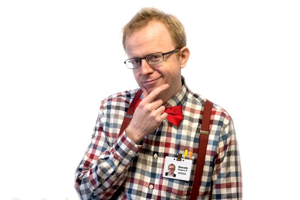
Noel Qualter is a London table magician, Surrey wedding magician and worldwide iPad magician who performs at events across the UK and the world. He never leaves home without at least 3 wifi enabled devices and spends an unhealthy amount of time on the internet. In fact, he is writing this now, pretending to be writing in the 3rd person.


